To use as the main content on my double page spread I interviewed the band that are fronting my magazine. Being the genre of indie-rock, the band would mostly like to focus on their music rather than themselves, so therefore, most of the questions that I tried to ask were related to the music rather than their personal lives and personality. However some of the band’s energetic personality has to be captured in order to interest and capture the target audience, so I have made sure that the layout of the double page spread will be lively, expressive, and very personal to the band.
However, I think that the interview may be too long for my double page spread, and may not be able to include it all in my magazine. If this is the case, I will cut out the parts I feel that are least involved with The Weak(end) Arrow’s actual music career, as this information is the most important to include, and to be prioritised above other information.
They’re young, dumb, and full of...indie tunes. They call themselves The Weak(end) Arrows, the young band made up of Sam Turner, 16, Louis Flanagan, 17 and Connor Simmons, 17, all from the small Essex town of Loughton. At FUSED Magazine, we were expecting three boys serious-headed, sensible, and all around stern. ...Boy were we wrong. The Weak(end) Arrows strolled in (an hour late, may we add) laughing and joking, so laid-back that they were almost horizontal. Though despite the messy start with a flurry of arguing about their instruments and bickering in the recording room, we couldn’t help but to find The Weak(end) Arrows a tiny bit loveable, and are simply pretty damn chuffed to be able to give the boys their first ever interview.
Interviewer: So what’s all your names and what do you do in the band?
Sam: I’m Sam, I’m lead guitarist and lead vocals
Connor: I’m Connor, I do backing and bass
Louis: I’m Louis, I hit things...
[Band laugh]
Interviewer: Cool, so who is your major influence as a band?
Sam: Hmm that’s funny because I think we all have different influences, because he *points to Connor* likes stupid...stuff, he * points to Louis* likes Screamo, and I sort of, like a bit of everything, so I think it’s a collective thing. We have our own style.
Interviewer: What’s stupid stuff?
Sam: You ever heard of the Cold War Kids?
Connor: They’re this awesome mix of blues and indie, and he hates them because –
Sam: You say they’re awesome..
Connor: They are awesome!
Sam: Yeah but they’re not
Connor: They just are
Interviewer: So how long have you been together as a band?
Sam: *thinks* Hmm not that long
Connor: About a year
Sam: A year-ish yeah...give or take a couple of months.
Interviewer: Did you all want to be in a band to start with, or?
Sam: Well no, Louis here bought a drum-kit, and we sort of thought I’ll play guitar, Connor can do bass, why not? Put it together and see what you get.
Interviewer: Had any of you played before?
Sam: Yeah I’d been playing guitar since I was like in year 7, so
Interviewer: I thought you were gonna say since you were about two
[Band laughs]
Connor: I’ve been playing bass on and off for years, never been particularly good at it. But y’know, better than these guys.
[Band laughs]
Interviewer: Didn’t they buy you a bass?
Connor: Oh yeah! They did, for Christmas...thank you.
Sam: Why don’t you explain what happened to that, by the way?
[Band laughs]
Connor: Well.. it was icy, and someone distracted me in the distance so it’s totally their fault..but I fell over and broke it a little bit...
[Band laughs]
Sam: And that’s what he does to our Christmas presents.
Connor: Yeah but I fixed it...sounds crap but I fixed it.
Interviewer: I think it’s nice that you buy each other musical presents, Louis’s drum skin aswell?
Sam: Yeah, we’re just generous people
Connor: Mm
Sam: Where’s that 50p you owe me by the way?
*band laughs*
Interviewer: So where have you been playing?
Sam: Erm, we try and do it every week, on Wednesday night there’s a jam night down in the pub in Debden called The Churchill, we just go up there play a few songs, bit of a laugh really...and that’s sort of what we’ve been doing recently.
Connor: Then we heard about this thing and thought we’d give it a go
Interviewer: So what sort of music have you been listening to at the minute, any favourite albums at the minute?
Sam: What at the moment? Hmmm what’s recently come out...
Connor: At the minute the three of us have been getting into Enter Shikari
Sam: Oh yeah big time
Connor: They’re just released a sort of, it’s an E.P really, just a sort of follow-up to their last album Common Dreads, there’s a few remixes and stuff. But yeah, Common Dreads, great album.
Sam and Louis: Yeah
Interviewer: What would you say is your favourite album ever? Of all time?
Connor: Ooh there’s a lot
Sam: Hmmm that is a hard one...back in the day Black Parade, it’s gotta be
Connor: That was way back in the old emo days
Interviewer: You say that like you’re not allowed to talk about it anymore...back in the emo days
Sam: Ahh yeah, past tense
[Band laughs]
Sam: I don’t think I could decide on a all-time favourite
Connor: No me neither
Interviewer: It’s okay, we’ll let you off...how have you found it getting into the local music scene?
Sam: There’s not too many, well, we know one other but you know, local bands our age...not that I’ve noticed
Connor: Not really of our genre anyway, there’s a lot of heavy metal bands around here but not many sort of softcore, all-acoustic indie bands
Interviewer: Is there a lot of screamo?
Sam: A lot of screamo around yeah...there are quite a few bands like that
Interviewer: Does that make it sort of hard then?
Sam: I think getting gigs is the hardest thing about it
Connor: Yeah
Sam: If you were to phone up every pub in the area you’d probably get about two...so it’s hard to get gigs and stuff, but you just gotta keep trying
Connor: But you know most people are going up through the internet nowadays
Interviewer: Yeah that’s also true. So is there a big fan base for you guys?
Sam: Yeah all three of them
Connor: Yeah that’s us three
[band laughs]
Connor: My mum likes us
Sam: Yeah what is all that about, bands thanking their mum’s for the support? No, we don’t do that. They don’t do much.
Interviewer: Don’t they like you?
Connor: I’d like to thank my mum.
Sam: For what?
Louis: I’d like to thank your mum too...you know what I mean?
[Band laughs]
Interviewer: So you say as a band you’re not very interesting? You seem quite interesting!
Connor: Well we’ve only been around a year...There’s not much we’ve done with our lives
[Band laughs]
Interviewer: Got a highlight of the year or anything?
Connor: Our first gig
Sam: Yeah that was a highlight
Interviewer: You’ve gotta tell us about your first gig
Sam: Well we went down the pub as we do, and there’s normally a host band there, and they set it all up, and you go on and do your song, and then they go back up there again. We got there, expecting it all to be set up....it wasn’t, we didn’t know what was going on, and then we heard the band had had a carcrash, and couldn’t get there. So then the pub owner came up to us, asked us to go back to our houses and get ALL our equipment, bring it back to the pub and put the night’s show on. So we had to host the whole night’s show
Connor: On pretty poor equipment, the mic stand was a golf trolley with a pole rammed in it and a mic screwed onto the end
Sam: Yeah only suitable for my height
Connor: But apart from that it went alright
Sam: Yeah the songs we done went well...there weren’t many of them
Interviewer: Well you know it surprised me that you could do that, I wouldn’t be able to go get a load of equipment and plug it all in
Sam: Oh I didn’t go and get it all I stayed in the pub and had a drink
[Band laughs]
Interviewer: Well if you start off with something like that, you can only get better, it must be quite an ego-boost to say you hosted it?
Sam: Yeah we were like that at first as it was our first gig and all, but then we just thought why not, let’s just go for it, we’re here now.
Interviewer: So just one more question for you, who do you aspire to be like?
Sam: Hmm well I like the old school big rock bands who just did what they wanted, they weren’t like most bands nowadays who just listen to their producers all the time... Led Zeppelin, there we go
Connor: Might be pushing it a bit far Sam
[Band laughs]
Interviewer: Where can anyone find you, have you got a Myspace or anything online?
Connor: Well we do have a facebook page but unfortunately Louis here who put it together is dyslexic, so it’s all spelt wrong...we’re The Weak(end) Arrow apparently
[Band laughs]
Sam: Search us on youtube, theres a few tracks on there, a couple of Editors covers
Interviewer: Are they quite an influence?
Connor: Oh yeah going back a while, but we love the Editors
Sam: Yeah they’re quite a big influence for us
Interviewer: Has that gone in the bin with the emo phase?
[Band laughs]
Connor: Oh no, they’re still quite recent
Interviewer: Have you got anything else coming up this year? Anything planned?
Connor: Oh yeah we’re gonna do some more recording, probably some more of our acoustic stuff in Sam’s room, and Sam’s also promised us to make us a proper youtube channel so look out for that...but apart from that no, as we said before we’re quite boring
Sam: And we’ll still be doing gigs on Wednesdays, if you go to The Churchill in Debden on a Wednesday you may see us there, if you’re lucky...or you may not.
Interviewer: With a wheelbarrow and a washboard?
Sam: Yeah, I’ll be playing a cheese grater.
[Band laughs]
Monday, 22 March 2010
Magazine name ideas
Thinking of a suitable name for my magazine was one of the things I found the hardest about constructing my magazine. I wanted to relate the name of the magazine with the genre of the indie-rock, inspired by the name of the magazine Kerrang! , of which’s name is onomatopoeia for the sound of a guitar’s strings being played.
Some of the name’s I came up with were:
Wire – The name ‘Wire’ was the first name I came up with and one that I liked instantly as it related to the musical instruments that indie-rock is mainly based on –guitars.
Wired – This name idea came from the previous name idea ‘wire’, and is just an extension I considered on the name.
Fusion – This name idea I think moves away from the theme of music and the way that the name relates with the musical instruments that indie-rock is actually produced with. Though I still like the idea as it as a powerful word that emits plenty of energy and emotion, which in itself could relate with music.
Fuse – Though I think this name is a bit short, I think it is a good name idea as it is quite powerful and effective, and relates to music through the relation to ‘electricity.’ With wire, this name is one of my favourite names.
Fused – Another extension on the previous name, I made it slightly longer, which I think has improved it, and still relates with the theme of music, in a slightly more subtle way than ‘wire’ or ‘wired’.
I have decided on the name ‘FUSED’ for my magazine, as I think it is quite a powerful, effective, expressive word to use for the title of a magazine with the genre indie-rock. It makes the reader think of electricity, which will lead onto guitars and other electric instruments used in rock music.

After experimenting with many different fonts, I decided on this logo to use for my final magazine as it is striking and bold, will catch the reader’s attention and is also fairly easy to read, with equally
Sunday, 21 March 2010
Front cover brief/Contents page brief/Double page spread brief
The band I have chosen to front my magazine are a band of three male, 17 year old members, named The Weak(end) Arrows. The Weak(end) Arrow’s genre is indie-rock, which is what the magazine genre is based on.
Although a male band will appeal mainly to an audience of female teenagers, I hope the content and message that the band portrays will also sway an audience of male teenagers to generate an interest in the band. As indie-rock is a genre that mainly appeals to a male audience anyway, I do not think this will be too hard to achieve. The appearance of the band and the layout of my magazine including content such as the articles that are available, the colour scheme, and other information will all contribute in the effectiveness of affecting my target audience, so I created my briefs with careful thought considering each of these points.

I have decided the front cover of my magazine will be fronted by ‘The Weak(end) Arrows’, an indie-rock band made up of three of my friends. In order to attract my target audience of the 16-21 age group, and of both the male and female population, the front cover will have to advertise mixed articles that will appeal to both males and females.
The colour scheme I intend to use will be that of mainly sky blues, blacks and some other neon colours such as oranges and greens to reflect the genre of indie, but also the youthful, energetic vibe that the band fronting the cover would like to reflect. The use of neon fonts may also help to draw attention to the magazine cover, therefore helping promotionally.
On the left is the basic plan of where the main articles, logo and the band fronting the magazine will be placed on the magazine’s final layout. The band will be aligned to the centre in order to attract the eye directly to the band photo first of all, with the name of the band large and prominent aligned also to the centre. I may also consider having the band photo overlapping the logo and name of the magazine slightly, in order for the band photo the most prominent thing on the page.
I am going to try and little as possible crowd the cover of my magazine with unnecessary photos, articles and information, as I think this may detract from how the genre indie-rock is shown through the magazine.

The contents page of a magazine is the most important page in conveying what is available to read in the magazine. The information needs to be laid out in a clear, orderly way, in order for the reader to find what they are looking for easily and quickly. The colour scheme cannot be too bright and distracting, and the font type not too difficult to read, in order for the small font of the contents page to not be too hard on the eyes and straining to read. I aim to include more photos and information on what is following in the further pages of the magazine, therefore, on the left of the page, there will be a large band photo advertising the double page spread with The Weak(end) Arrows and providing the page number, and around the right hand side edge and bottom there will be five more, smaller photos which push other articles available in the magazine. Pictures and photos attract the reader’s eye, which means that with a photo present, the article is more likely to be appealing to the reader.

The double page spread for my magazine I plan to be quite simple and basic in layout, as seen on the left of the page on the plan. The band photo will be landscape and take up the majority of the background, with an opaque box for the article content aligned to the bottom of the page. Four other band photos will be on the page, which I think is the majority that will be able to be fit in order to leave enough room for the article content, which will be an interview with the band. Again, as before, the type face cannot be too confusing and cannot vary too much from the font scheme used in the rest of the magazine’s layout, in order to keep the magazine consistent and as professional-looking as possible. The colours of the double page spread will have to be quite expressive of the band themselves, as the double page spread is all about them and conveying the message they wish to convey. Since they are also fronting the magazine, I aim to keep the colour scheme of the double-page spread quite similar to the cover, with shades of sky blues, though keeping it bright and energetic, youthful striking with oranges, yellows, greens and other neon colours.
Friday, 19 March 2010
Research and Analysis into the structure and content of existing magazines of the rock genre
Due to the lack of choice and difficulty finding an example of a magazine that solely focuses on the genre of indie-rock magazine, I have chosen to analyse NME Magazine in more detail. NME covers a broad range of music under the rock genre, indie-rock being one of those included. I have decided to gather some front covers of NME editions that feature an indie-rock band as the cover band/artist, which are shown below:
Front cover page examples:

The first thing I notice about this issue of NME is that the cover band is the main focal point of the magazine, the photo of the band appearing large and clearly on the page, even appearing in the foreground of the magazine’s logo itself. The name of the band: ‘Arctic Monkeys’ is placed larger than any of the other text on the page, justified left and spread across a large chunk of the magazine page. Though I noticed that the colour scheme of this text-aswell as the majority of the other text on the page- is kept fairly dull, in order not to attract too much attention away from the logo and name of the magazine, which is shown in a bright, eye-catching, red. There doesn’t seem to be much other crowded information on the page other than this focus on the main band-the band photo seems to be doing most of the work in terms of attracting the magazine’s target audience-although there is information about the rest of the articles that can be found inside, listed along the bottom and top of the page. ’15 new bands to get excited about’, can be read along the top - this text is noticeably typed in quite large capital letters, however, I noticed that again, the colour scheme of the font is fairly neutral and doesn’t seem to vary from the rest of the colour scheme that is used for the other text in order to keep the magazine’s logo the brightest object on the page.
Conclusively, this magazine’s layout is quite simple, basic, and spread out. There is no confusing clashes of colour or an assorted jumble of photos and blaring, loud text, which may represent the indie-genre as it is simply focused on the music, rather than the personality or image of the band.
 On the left is another example of a cover page from another NME magazine. This cover presents Kasabian as the cover band. As opposed to the previous cover, this cover is straight away noticeably louder, with more brighter, bolder red font that contrasts strongly with the black and white of the band photo, helping them to stand out also. On first look, the reader’s eyes will immediately be drawn to the bright red of the logo, or the title of the band which is centred and spreads across a large chunk of the middle of the page, which reads: ‘The return of Kasabian.’
As before, this cover band seem to do most of the work in terms of attracting the target audience in, with the rest of the information about inside articles justified left and placed almost at the bottom of the page, in far smaller font than the main article. The page layout is fairly simple again, with no clashing photographs, and set out in almost a sophisticated way, although I think that this cover is more interesting and exciting than the previous cover example. I particularly like the contrast of red, black and white, an effective colour scheme to use in catching the eye of the target audience and effective in conveying the genre ‘rock’, and something that I will certainly consider trying to create when I produce my own magazine.
 Contents page example:
The picture on the left shows the NME contents page. The masthead ‘NME this week’ dominates the page and immediately attracts the reader’s eye due to the black background it is based on and the contrast of the red and black in the title. Beneath this, there is a large photo of the Astoria, a London music venue that has, in recent years been closed down, and this photo takes up the majority of the page space. The caption below it, in quite large, capital letters states: ‘The End of the Astoria’, which sums up what the article is about almost instantly, as well as slightly dramatizing the sound of the article which may entice more readers into reading it.
The actual entire index is justified left, and listed down the side of the page, surprisingly small and narrow for the contents of the magazine. The font alternates between red for the name of the article and black for the page number, in order for ease of distinguishing between the name and page number, but also for the presentation of the page. On the right side of the Astoria photo, there is a more in-depth summary of what can be found in the index, every few articles classified into sections under headers, such as ‘News’, ‘Radar’, ‘Reviews’, ‘Live!’and ‘Features’. Conclusively, the contents page of this edition of EMA appears to be very detailed and makes ease-of-access for the reader for the easy to follow page layout, and two index lists. The contents page achieves its purpose of providing all the information about what is inside and available to read throughout, therefore, I am going to try and incorporate some of these elements found on this contents page into my own work. The only thing I would consider changing is to include more photographs on the contents page alongside some of the other articles rather than just the one, as I think this would make the whole layout more absorbing and certain articles more appealing to read.
 Double page spread:
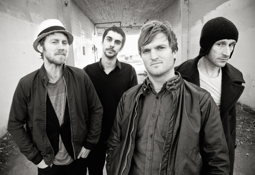
On the right is an example of a double page spread from NME magazine. The spread features the band as the main image, the photo expanded out to the far corners of the page to make up the background of the page for maximum impact on the reader when they turn onto the page. I particularly liked this example of a double page spread above others as I think it reflects the theme of indie-rock well, with the dull, monotone colours used for the photo and blue/white/black colour scheme that seems to run through. The text box is located on the right page, and takes up the majority of that bottom corner. The message that is trying to be portrayed through this article is a rebellious image –the band seem to be situated in a remote area, their expressions and poses serious and determined. The idea of this anti-authority ‘rebel’ image is also reinforced by the title of the article heading the body of text located in the bottom right: ‘Young rebel set’. The message that is trying to be portrayed across doesn’t seem to be that of fun-loving, lively image. I like the whole structure of the layout of this page, the simplicity of it, though in my own magazine I would like to include more photographs, images and information to portray the youthful, fun-loving image that the band represent.
Front cover page examples:

The first thing I notice about this issue of NME is that the cover band is the main focal point of the magazine, the photo of the band appearing large and clearly on the page, even appearing in the foreground of the magazine’s logo itself. The name of the band: ‘Arctic Monkeys’ is placed larger than any of the other text on the page, justified left and spread across a large chunk of the magazine page. Though I noticed that the colour scheme of this text-aswell as the majority of the other text on the page- is kept fairly dull, in order not to attract too much attention away from the logo and name of the magazine, which is shown in a bright, eye-catching, red. There doesn’t seem to be much other crowded information on the page other than this focus on the main band-the band photo seems to be doing most of the work in terms of attracting the magazine’s target audience-although there is information about the rest of the articles that can be found inside, listed along the bottom and top of the page. ’15 new bands to get excited about’, can be read along the top - this text is noticeably typed in quite large capital letters, however, I noticed that again, the colour scheme of the font is fairly neutral and doesn’t seem to vary from the rest of the colour scheme that is used for the other text in order to keep the magazine’s logo the brightest object on the page.
Conclusively, this magazine’s layout is quite simple, basic, and spread out. There is no confusing clashes of colour or an assorted jumble of photos and blaring, loud text, which may represent the indie-genre as it is simply focused on the music, rather than the personality or image of the band.

As before, this cover band seem to do most of the work in terms of attracting the target audience in, with the rest of the information about inside articles justified left and placed almost at the bottom of the page, in far smaller font than the main article. The page layout is fairly simple again, with no clashing photographs, and set out in almost a sophisticated way, although I think that this cover is more interesting and exciting than the previous cover example. I particularly like the contrast of red, black and white, an effective colour scheme to use in catching the eye of the target audience and effective in conveying the genre ‘rock’, and something that I will certainly consider trying to create when I produce my own magazine.

The picture on the left shows the NME contents page. The masthead ‘NME this week’ dominates the page and immediately attracts the reader’s eye due to the black background it is based on and the contrast of the red and black in the title. Beneath this, there is a large photo of the Astoria, a London music venue that has, in recent years been closed down, and this photo takes up the majority of the page space. The caption below it, in quite large, capital letters states: ‘The End of the Astoria’, which sums up what the article is about almost instantly, as well as slightly dramatizing the sound of the article which may entice more readers into reading it.
The actual entire index is justified left, and listed down the side of the page, surprisingly small and narrow for the contents of the magazine. The font alternates between red for the name of the article and black for the page number, in order for ease of distinguishing between the name and page number, but also for the presentation of the page. On the right side of the Astoria photo, there is a more in-depth summary of what can be found in the index, every few articles classified into sections under headers, such as ‘News’, ‘Radar’, ‘Reviews’, ‘Live!’and ‘Features’. Conclusively, the contents page of this edition of EMA appears to be very detailed and makes ease-of-access for the reader for the easy to follow page layout, and two index lists. The contents page achieves its purpose of providing all the information about what is inside and available to read throughout, therefore, I am going to try and incorporate some of these elements found on this contents page into my own work. The only thing I would consider changing is to include more photographs on the contents page alongside some of the other articles rather than just the one, as I think this would make the whole layout more absorbing and certain articles more appealing to read.

On the right is an example of a double page spread from NME magazine. The spread features the band as the main image, the photo expanded out to the far corners of the page to make up the background of the page for maximum impact on the reader when they turn onto the page. I particularly liked this example of a double page spread above others as I think it reflects the theme of indie-rock well, with the dull, monotone colours used for the photo and blue/white/black colour scheme that seems to run through. The text box is located on the right page, and takes up the majority of that bottom corner. The message that is trying to be portrayed through this article is a rebellious image –the band seem to be situated in a remote area, their expressions and poses serious and determined. The idea of this anti-authority ‘rebel’ image is also reinforced by the title of the article heading the body of text located in the bottom right: ‘Young rebel set’. The message that is trying to be portrayed across doesn’t seem to be that of fun-loving, lively image. I like the whole structure of the layout of this page, the simplicity of it, though in my own magazine I would like to include more photographs, images and information to portray the youthful, fun-loving image that the band represent.
Conclusion
This research has helped me to decide on what kind of layout and structure I need to base my own magazine’s layout on in order to portray the genre of indie-rock through my work. I think the layout I will try and achieve will be fairly simple to reflect the theme of indie-rock, but also incorporating other images and elements into the photographs and general layout of the page which will hopefully capture the youthful, energetic vibe I am hoping to achieve through the band that is fronting the magazine. More details of my plans for each part of the magazine will be included in my next blog, which will consist of individual briefs for each the front page, the contents, and the double page spread.
Wednesday, 17 March 2010
Research into the indie-rock genre, and existing indie-rock artists and bands
Indie-Rock
As I stated in my last blog, I have made the decision to base the genre of my magazine around the genre indie-rock. Indie rock is a branch off of the widespread genre rock, and first originated in UK and US in the early 1980’s, although the genre has mainly rose to popularity throughout the 2000’s.
‘Indie’ is an abbreviation used for ‘independent’, as indie artists are renowned for producing music individualistically, breaking the barriers against large, major record companies in an effort to maintain total control over their own music and what is produced. Some indie artists even go to the length of self-owning and controlling their own record label in order to maintain their total control and freedom.
Commonly noticed factors about Indie-Rock
Indie rock bands and artists consider themselves unrestrained to explore lyrical subjects, sounds, emotions and attitudes that may not necessarily appeal to a large, mainstream audience. Indie artists have a passion for their music, the profit being made not being the main concern to them - the main aim and focus being maintaining their personal taste without influence from anything mainstream, and harboring concerns about commercialism.
Indie-rock seems to be predominantly produced by male artists, although attracts an audience from both the male and female population.
Examples of existing bands and artists in the indie-rock genre
Cold War Kids
Cold War Kids are an example of a indie-rock band of four members from Long Beach, California, formed in 2004. The Cold War Kids are especially a good example of how the internet today is having an influence on how smaller bands are promoting and making a name for themselves through the growing, popular internet blogging and networking community without the aid of a large, mainstream record company. After some time, the band signed to the large record label Downtown Records.
Something in particular I noticed about the Cold War Kids when watching their music videos, is that the band themselves are not usually involved. This fits in with the stereotype that indie artists and bands want to be known and respected for their music, rather than the band ‘personalities’ or personal image that they might present. The way they appear and their personal image is not the top priority for the Cold War Kids, they do not want to attract an audience who like them for their image, instead aiming to target an audience who enjoys and appreciates the music they produce, rather than whom the band consists of.
Cold War Kids are particularly an example of a band who maintains an incredibly individual style with their music, I cannot name one other band who are quite like Cold War Kids. Their lyrics are emotive, expressive and personal, and in some particular songs almost tell a story, such as the lyrics to ‘Saint John’.
Arctic Monkeys
 The Arctic Monkeys are an English band of four members from Sheffield, England, and formed the band in 2002. Though the top genre of Arctic Monkeys is debatable, Arctic Monkeys can definitely be described as indie-rock as one of their many mix of genres, others of which include alternative rock, garage rock, and post-punk revival. Arctic Monkeys are also an example of how modern-day bands are finding fame and success via the internet (social-networking, blogging, etc), Arctic Monkeys in particular holding the title for being one of the first bands to get extremely successful in this way.
 Typically of an indie rock band, Arctic Monkeys are well-known for resisting signing to a large record label in order to maintain their freedom and control over what was produced and avoid conformity, refusing to change their songs or take advice from labels to suit the industry.
Eventually Arctic Monkeys made the decision to get signed to a small record label named ‘Domino’ in June of 2005. The band were attracted to the record company for the DIY approach to it, the way the label was run from the owner’s flats and he only signed bands that he actually personally liked, not what was going to potentially do well in the industry and make lots of profit.
Editors
Editors
Editors an indie rock band formed in 2002, in Birmingham, and consists of four members. Aswell as indie-rock, Editors could also be described under the genre of post-punk revival.
 Editor’s own adaptation of dark indie rock makes connections or draws influence from older bands and contemporary, newer ones. Editors are often compared to post-punk bands Joy Division and Echo and the Bunnymen

Another heavy comparison was made of the Editors to American indie band Interpol, causing both bands to immediately play down both associations with each other and their musical style in a bid to keep as independent as possible.
The first record label that Editors were signed to was a small indie record label based in Newcastle called Kitchenware Records, which Editors is now the biggest successor of.
Conclusion drawn from this research
The first record label that Editors were signed to was a small indie record label based in Newcastle called Kitchenware Records, which Editors is now the biggest successor of.
Conclusion drawn from this research
Using the research on the three bands described above, I have come to the conclusion that indie-rock is a genre based mainly on individuality and independence. Nothing is more important to artists of this genre than the music, with the personal appearance and image of the band not being the top priority at all. Therefore, through my magazine if I am intending to reflect the genre of indie-rock, I intend to solely focus on the band’s music more than the members themselves who are involved, in order to reflect ‘Indie-rock’ the best I can through my magazine.
Although, of course, personality and personal image is important to a band in order to attract the fan-base, but indie-rock doesn’t see this as a priority; such as the Cold War Kids, who would rather their fans appreciated them for their music, rather than who they are themselves.
Tuesday, 2 March 2010
Conclusion based on media questionnaire results
Using the results gathered from my questionnaire about magazine preferences, I am going to draw a conclusion about what target audience I am going to target, what I am going to include in my magazine, and what genre I would most like to focus on for my magazine, so I have set out, strong guidelines for myself to follow in the development of my magazine.
Target Audience
Firstly, based on my questionnaire results, I would like to make my magazine as unisex as possible. However, as I have chosen my magazine to be fronted by a male band, there is a chance that the magazine may end up appealing more to a slightly more female audience rather than male. According to the survey results that I took, the results of the question: 'How often does the way the magazine appears/who is fronting it affect whether you buy it or not?' Told me that the majority of people are influenced occasionally by the band who is fronting the magazine, with four of the votes. Three people voted that they are influenced frequently by the band/artist fronting the magazine, which tells me that the cover artist is an important part of who my magazine will end up targeting.
The age range I am hoping to appeal to is in the 16-20 age range, I believe that using my own age group as a target audience for my magazine will be useful to me as I can grasp a better idea on what will be popular, from having first-hand experience of what I would like to see in a music magazine. Choosing this age bracket is also a good idea as the majority of people that took my questionnaire fitted into this age group, which means that I will hopefully end up producing a magazine that will appeal to the majority.
Genre
The genre I have chosen to focus on is the genre of indie rock. I will be undertaking more research into the genre of indie rock in the near future, in order to be able to get a grasp of what the genre includes and what I can include in my magazine's layout and content that will allow the genre to show through. My results that I gathered from my questionnaire tell me that the most popular genre voted for was rock, with 4 votes, followed by indie with 3 votes.
Monday, 1 March 2010
Research Questionnaire Results
In order to get a better idea on what music magazine to produce, and what will appeal most to the target audience I am trying to get through to. I asked 10 people to take a survey about what they would most like to see in a music magazine.
The results are shown below:
Question one: Are you male or female?
.jpg)
In order to make the research as unbiased and as fair as possible, I asked five female and five male people to take my questionnaire.
 Question two: What is your age group?
The majority of the people I asked were people in my year at school, hence the reason they were in the age category 16-20. Two people I asked were at the other end of the scale, in the 41+ category. One person was under 16, and one from the 26-30 category. The age ranges I used were broad, which means that inevitably the results will be more diverse and varied. However, I realised that this question had a fault as soon this is not useful to my research, as the target audience I am appealing to is the 16-20 age bracket.
Question 3: Out of the below choices, what’s your favourite genre of music?
The graph above show’s that the majority of people who took this survey pref.jpg) er the rock genre, with 4 votes out of 10. This was closely followed by the indie genre, with 3 votes, and metal, pop and other each gaining one vote each. The RnB genre gained no votes. I am pleased with the results that rock is the most popular genre of music magazine, as this means that I should produce a magazine that is based around the rock genre, which suits me well as that is the kind of magazine that I wanted to produce.
er the rock genre, with 4 votes out of 10. This was closely followed by the indie genre, with 3 votes, and metal, pop and other each gaining one vote each. The RnB genre gained no votes. I am pleased with the results that rock is the most popular genre of music magazine, as this means that I should produce a magazine that is based around the rock genre, which suits me well as that is the kind of magazine that I wanted to produce.
Question 4: What do you prefer to read about in a music magazine?.jpg)
The graph above show’s that the most popular band articles to read about are well-known, established bands, with the majority of the vote with 6 people. The second most popular were for obscure and unsigned bands, with 2 votes. The option for less-popular, up-and-coming bands got one vote, and one person also voted for the option that they do not read music magazines. This information tells me that in creating my own magazine, I should include more information about well-known, well-established bands, as this will be what more readers will seek out and target. However, the rules state that due to a copyright, I am unable to use a well-known band and already existent photos.
Question 5: What area of content do you prefer to read about?
.jpg)
The most popular area of content that the survey told me that people like to read about is celebrity gossip, with 4 of the votes. Interviews followed, with 3 people voting that they are the most popular type of content, the least popular kind of article was found to be real-life stories with two of the votes. One person voted that they prefer to read another type of article listed, or do not read music magazines. This tells me that in my magazine, I should include articles related to celebrity gossip, whether that is stories involving band members, or individual artists. Interviews also were found to be popular in music magazines, which may also be something I need to include as part of my magazine, advertising interviews with well-known, and unknown bands alike inside
Question 6: How often does the way the magazine appears/who is fronting it affe.jpg) ct whether you buy it or not?
ct whether you buy it or not?
The majority of the people that took this survey voted that the way the magazine appears affects them occasionally, with 4 people voting for this option. Three people voted that it frequently affects whether they buy the magazine or not, two people for always, and one people for never. These results show that the way the magazine is presented, who is on the front cover, and the articles/general layout chosen to be shown on this front cover is quite important for the success of my magazine. Therefore, with my own magazine, I will focus on the front cover especially to engage the reader and ensure the total success of my magazine.
The results are shown below:
Question one: Are you male or female?
.jpg)
In order to make the research as unbiased and as fair as possible, I asked five female and five male people to take my questionnaire.
The majority of the people I asked were people in my year at school, hence the reason they were in the age category 16-20. Two people I asked were at the other end of the scale, in the 41+ category. One person was under 16, and one from the 26-30 category. The age ranges I used were broad, which means that
 inevitably the results will be more diverse and varied. However, I realised that this question had a fault as soon this is not useful to my research, as the target audience I am appealing to is the 16-20 age bracket.
Question 3: Out of the below choices, what’s your favourite genre of music?
The graph above show’s that the majority of people who took this survey pref
.jpg) er the rock genre, with 4 votes out of 10. This was closely followed by the indie genre, with 3 votes, and metal, pop and other each gaining one vote each. The RnB genre gained no votes. I am pleased with the results that rock is the most popular genre of music magazine, as this means that I should produce a magazine that is based around the rock genre, which suits me well as that is the kind of magazine that I wanted to produce.
er the rock genre, with 4 votes out of 10. This was closely followed by the indie genre, with 3 votes, and metal, pop and other each gaining one vote each. The RnB genre gained no votes. I am pleased with the results that rock is the most popular genre of music magazine, as this means that I should produce a magazine that is based around the rock genre, which suits me well as that is the kind of magazine that I wanted to produce.Question 4: What do you prefer to read about in a music magazine?
.jpg)
The graph above show’s that the most popular band articles to read about are well-known, established bands, with the majority of the vote with 6 people. The second most popular were for obscure and unsigned bands, with 2 votes. The option for less-popular, up-and-coming bands got one vote, and one person also voted for the option that they do not read music magazines. This information tells me that in creating my own magazine, I should include more information about well-known, well-established bands, as this will be what more readers will seek out and target. However, the rules state that due to a copyright, I am unable to use a well-known band and already existent photos.
Question 5: What area of content do you prefer to read about?
.jpg)
The most popular area of content that the survey told me that people like to read about is celebrity gossip, with 4 of the votes. Interviews followed, with 3 people voting that they are the most popular type of content, the least popular kind of article was found to be real-life stories with two of the votes. One person voted that they prefer to read another type of article listed, or do not read music magazines. This tells me that in my magazine, I should include articles related to celebrity gossip, whether that is stories involving band members, or individual artists. Interviews also were found to be popular in music magazines, which may also be something I need to include as part of my magazine, advertising interviews with well-known, and unknown bands alike inside
Question 6: How often does the way the magazine appears/who is fronting it affe
.jpg) ct whether you buy it or not?
ct whether you buy it or not?The majority of the people that took this survey voted that the way the magazine appears affects them occasionally, with 4 people voting for this option. Three people voted that it frequently affects whether they buy the magazine or not, two people for always, and one people for never. These results show that the way the magazine is presented, who is on the front cover, and the articles/general layout chosen to be shown on this front cover is quite important for the success of my magazine. Therefore, with my own magazine, I will focus on the front cover especially to engage the reader and ensure the total success of my magazine.
-Amelia Larkin
Subscribe to:
Posts (Atom)